Warmi
User Experience and User Interface Design
Project Overview:
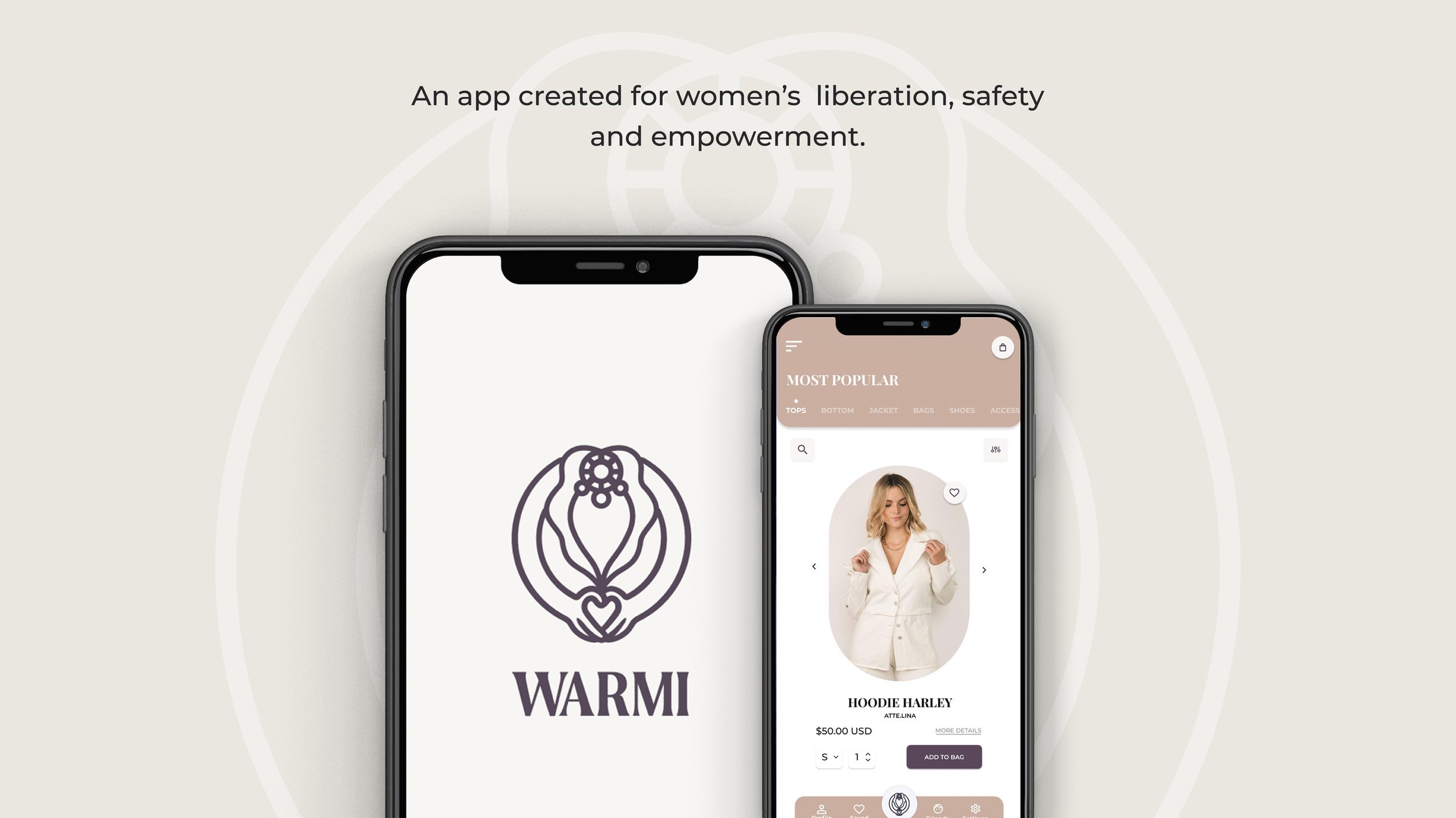
Warmi is a mobile application designed as an astute protective tool, swiftly signaling assistance for women in times of need. It integrates safety features within a functional e-commerce interface to conceal its protective capabilities to ensure seamless utilization.
Tools Used:
- Adobe Illustrator, Adobe Photoshop, Figma, Google Suite, Zoom.
OVERVIEW
There is violence against women all around the world, but this time we will focus in the country of Peru, a developing society where women are constantly looking over their shoulders in fear that they will be the attacked either from someone they know or from a stranger.In this case study, we will ideate and create a safety tool to make Peruvian women feel more at ease and empowered.
THE PROBLEM
Existing apps out in the market that are created as a safety tool are limited in their ability to be used intuitively and swiftly which prevents women from being able to protect themselves in a rapid manner. Additionally, these apps easily reveal themselves to be a protective tool making it challenging for women that are in abusive relationships or women to use.
THE GOAL
The main objective is to create a mobile app that provides a safety tool that is instinctive to use while having the ability to camouflage itself into an interface that deceives the real purpose of the app.
THE SOLUTION
It was extremely important to create an app that can be used in plain sight without it giving away its true purpose. In response, I came up with the idea to structure the app with two defining pages: FRONT-END & BACK-END.
THE FRONT-END
This is the main page of our app which is a functional e-commerce shop where users are able to browse and make purchases.
The interface was designed to disguise the actual purpose of the app, which is providing safety tools that users can access by dragging up the logo in the navigation bar.
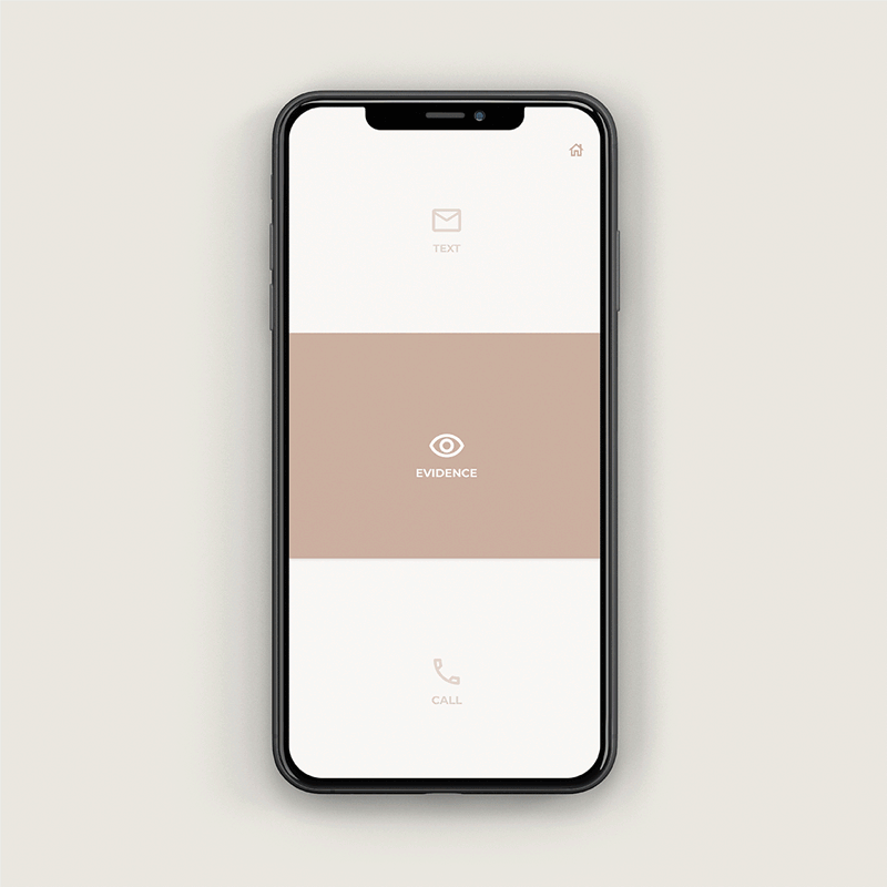
Main features include: Emergency call, emergency text and collect evidence
FRONT-END : MAIN FEATURES
EMERGENCY CALL
If user selects the emergency call feature, it will automatically call to the Peruvian version of 911. There is no need to dial the number so the user can buy herself time.
Once it is dialing, there will be a toggle bar with two options: "Speak Ok" and "Can't Speak".
"Speak Ok" is when the user feels comfortable speaking out loud without the fear of being heard by the attacker.
"Can't Speak" is designed for users that have to be discreet when seeking for help.
FRONT-END : MAIN FEATURES
EMERGENCY TEXT
When user selects this feature, it will automatically send a text with a pre-written message set by the user along with their live location.
The receivers of the text will be people that the user has previously selected.
If the user believes they are not longer in danger, there is an option to retrieve the text to not raise an unwanted alarm to her selected receivers.
FRONT-END : MAIN FEATURES
COLLECT EVIDENCE
The third feature is collecting evidence, where the user can take a photo or video that will be automatically saved in the evidence log that can be found in the back-end of the app.
The evidence will be recorded with the location and time that it was taken.The receivers of the text will be people that the user has previously selected.
If the user believes they are not longer in danger, there is an option to retrieve the text to not raise an unwanted alarm to her selected receivers.
BACK-END
The back-end can be access by double-tapping the logo in the bottom navigation bar from the front-end page.
Evidence taken is logged for future reference and use. It can be edited and share with the user's contacts.
Users can customize the settings for the emergency call and texts.
There are also two other features which are access to mental health services and an online community with other women that have the app.
JUNT@S
As seen in the image, there is no clear indication as to which button the user has to click on in order to make an emergency call.
It is visually cluttered and hard to navigate the interface.


THE UX PROCESS
COMPETITIVE ANALYSIS
Before diving into the user interviews, it was extremely important to understand the current market space of similar mobile applications and identify their limitations. By doing this, I know what users are being offered and come up with questions on how the market could improve to deliver better features and experiences.
In our competitive analysis research, we discovered that there are a couple of similar apps like WARMI in the market, however, they are lacking of effectiveness and aren't built with the most intuitive approach. Below is an example of an app that we found in our research.

USER INTERVIEWS
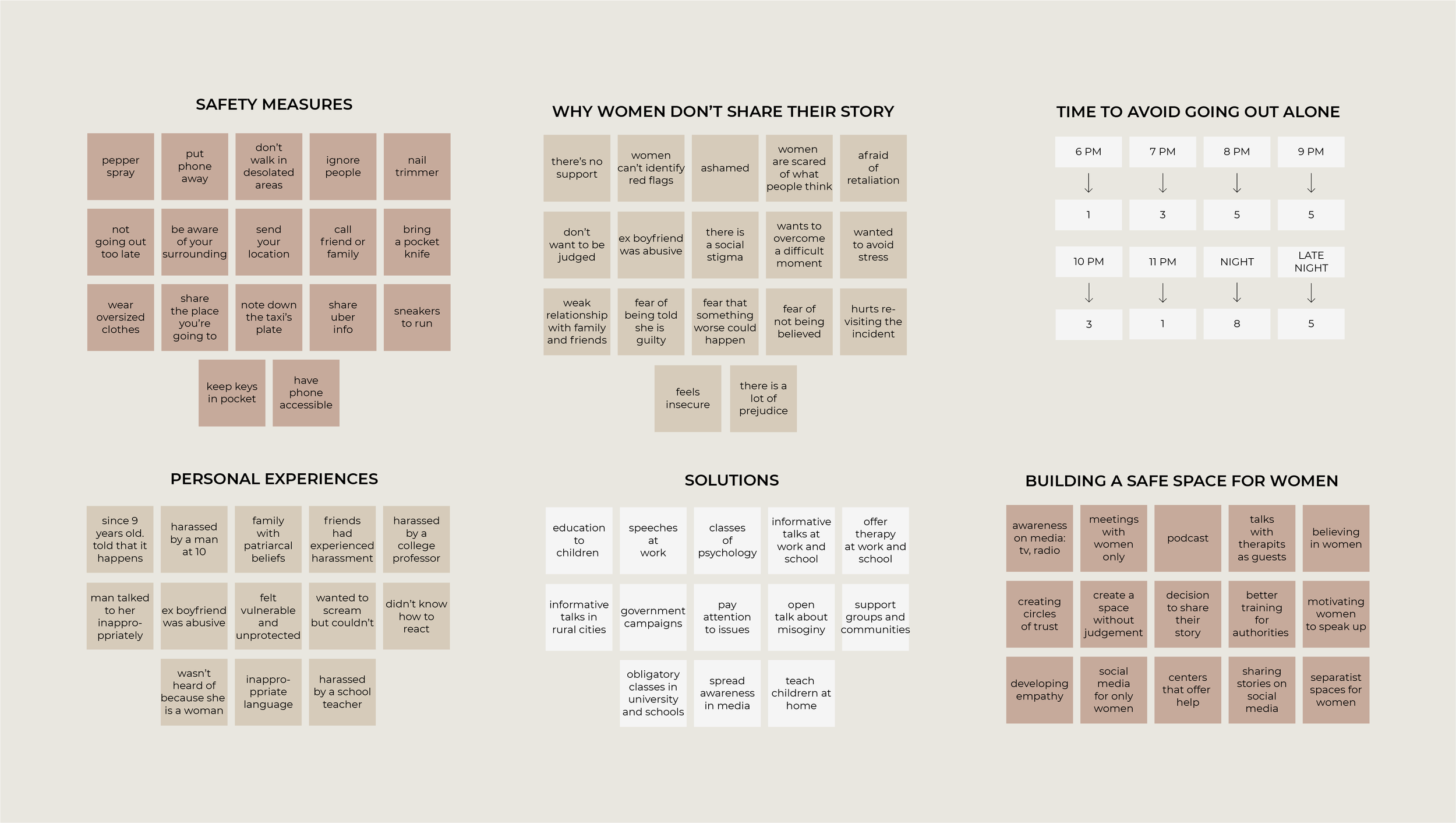
For this step, we came up with a series of questions to help us understand our users' paint points. It is important to know our users as much as possible in order to come up with fundamental and proper requirements that the future design needs. We organized these information on an Affinity Clustering map.
On top of this, we conducted an Instragram poll through an account focused on women's rights that are followed by the same type of users that our app targets. We made ground-breaking discoveries in this poll and were able to put together the essential features that our app needs.

USER PERSONAS
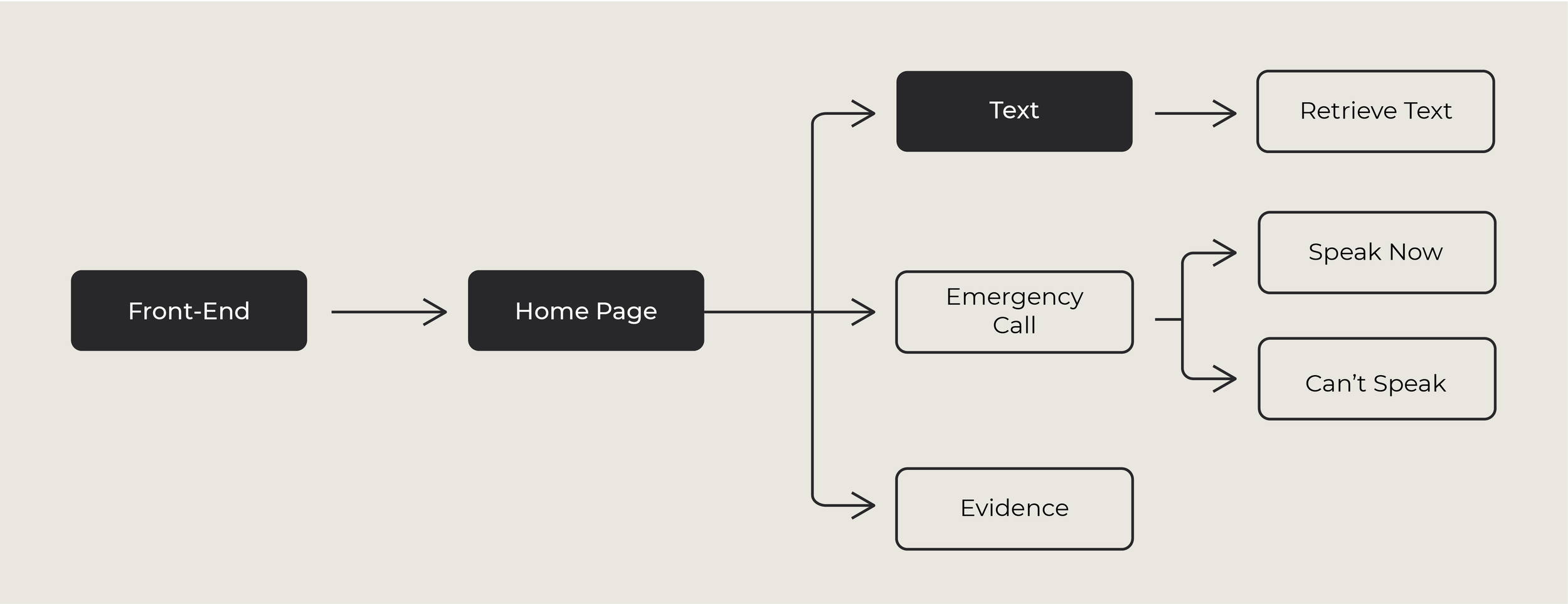
After identifying and prioritizing our users' needs, I built a site map to set out the process and interactions that our users would do in our app. By visualizing it in a map, it helps us clarify if the steps are being performed smoothly and without broken links.


SITEMAP
After identifying and prioritizing our users' needs, I built a site map to set out the process and interactions that our users would do in our app. By visualizing it in a map, it helps us clarify if the steps are being performed smoothly and without broken links.

USER JOURNEY & USER FLOW
Once we put together the site map and created the architecture of the app, we wanted to ensure that the steps were fast and simple to accomplish. We did this by creating a user journey based on similar experiences from the interviewees and mapped out a user flow of the user's interaction with the app.

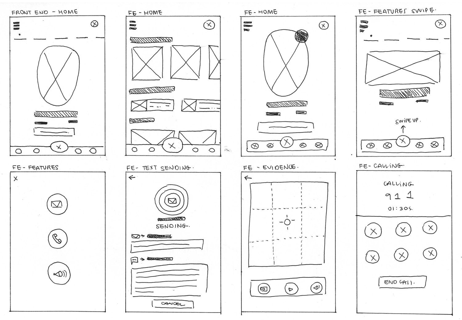
SKETCHES
Sketched multiple explorations of the home page with the goal to make it very simple and minimal so that it is easy to navigate and rapidly access the safety tool features.
We opted for creating icons to easily represent the main actions for safety tools.
Here we tackled the back-end design were users can access an online community, mental health resources and educational material.
It was also important to figure out how the system of sending emergency text and what would be the best approach for users to set up this feature.
MID-FIDELITY MOCK UPS
It was important to have an onboarding process feature when users first download the app so they can have a fundamental understanding of the main features that the app provides and how to access them.
Setting up the emergency contacts was also important to create having in mind to make it smooth and intuitive since it is the fundamental tools in our app.